Founded in 2016 and based in Stuttgart, LuxFlux is a software company specialising in the analysis of hyperspectral data. Their mission is to take hyperspectral imaging technology out of the lab and into compact, real-time solutions for industrial and embedded applications.

To compete in a fast-evolving market, LuxFlux needed a refreshed brand identity, one that captured the sophistication of their technology while positioning them as a credible, forward-thinking provider of micro-spectrometer solutions. The goal was to retain the core tone of their existing identity while modernising it into a scalable visual system.
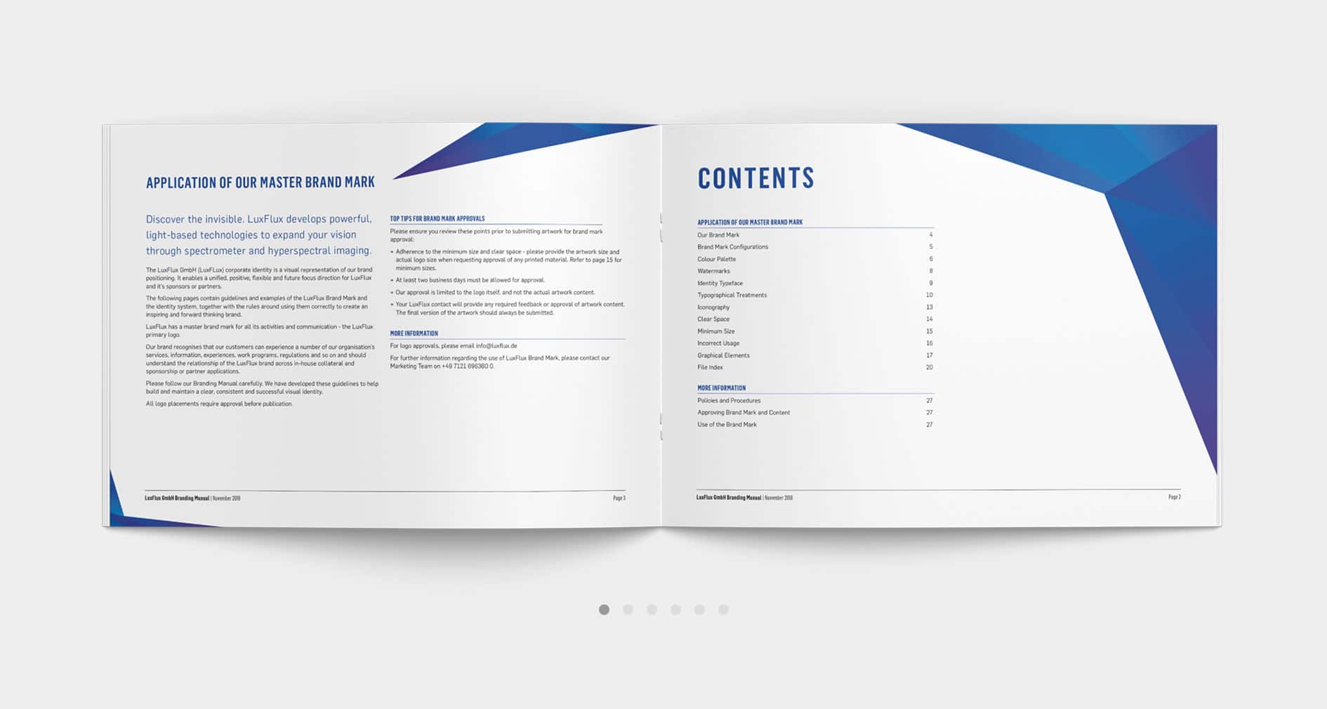
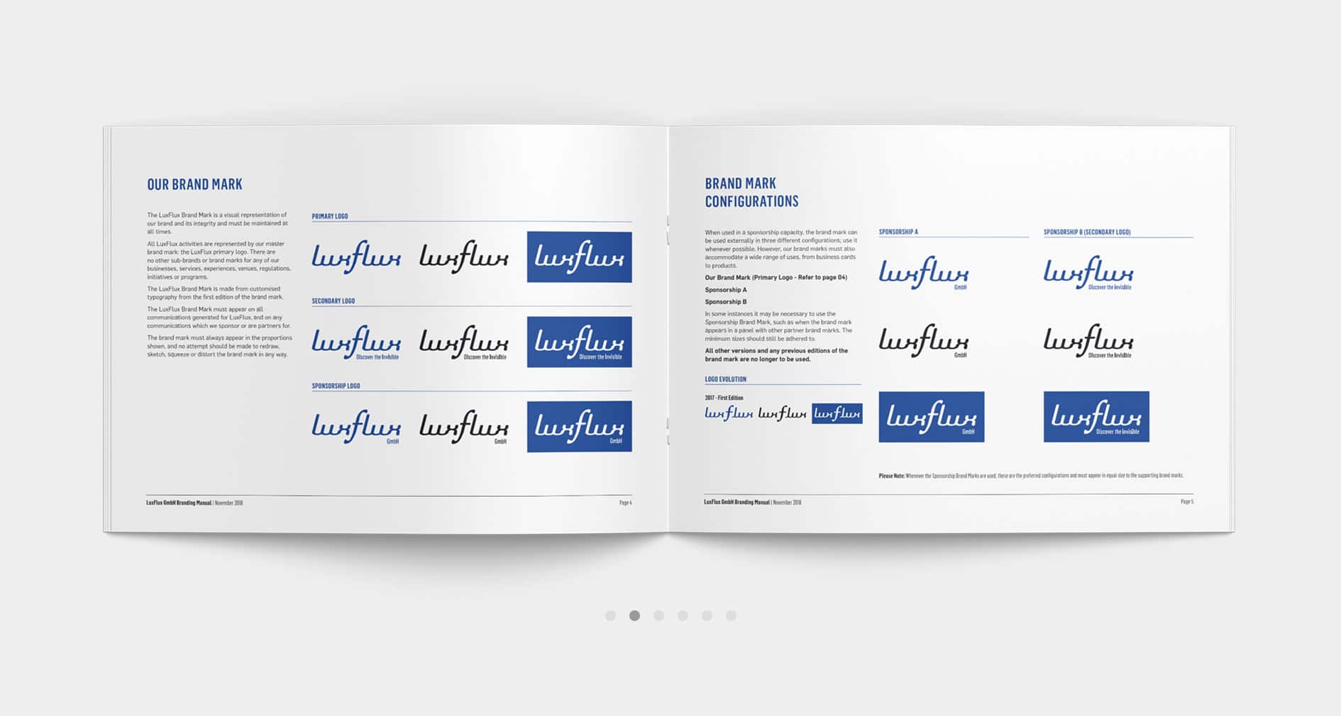
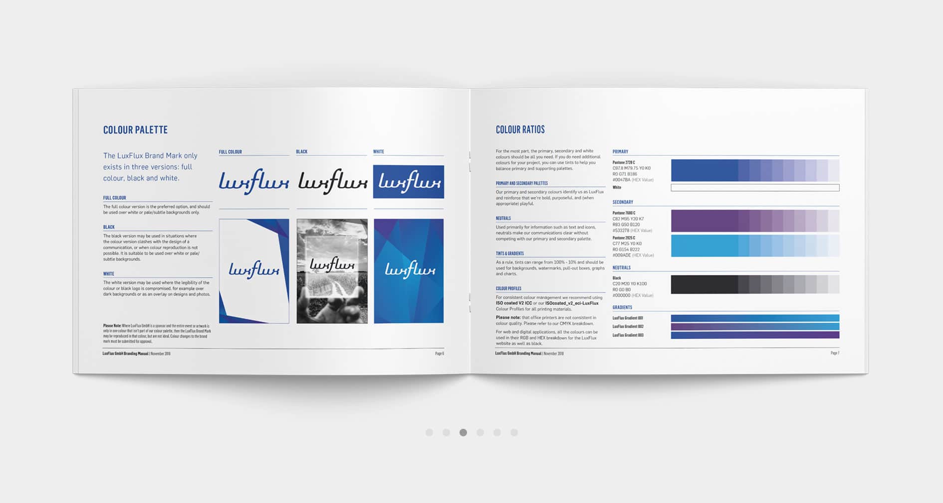
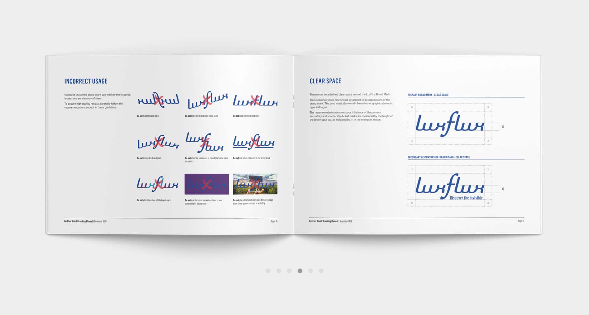
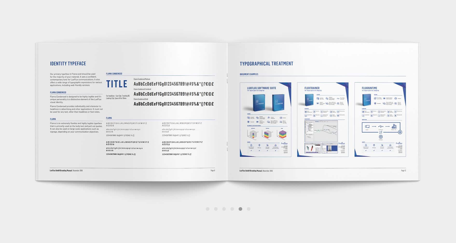
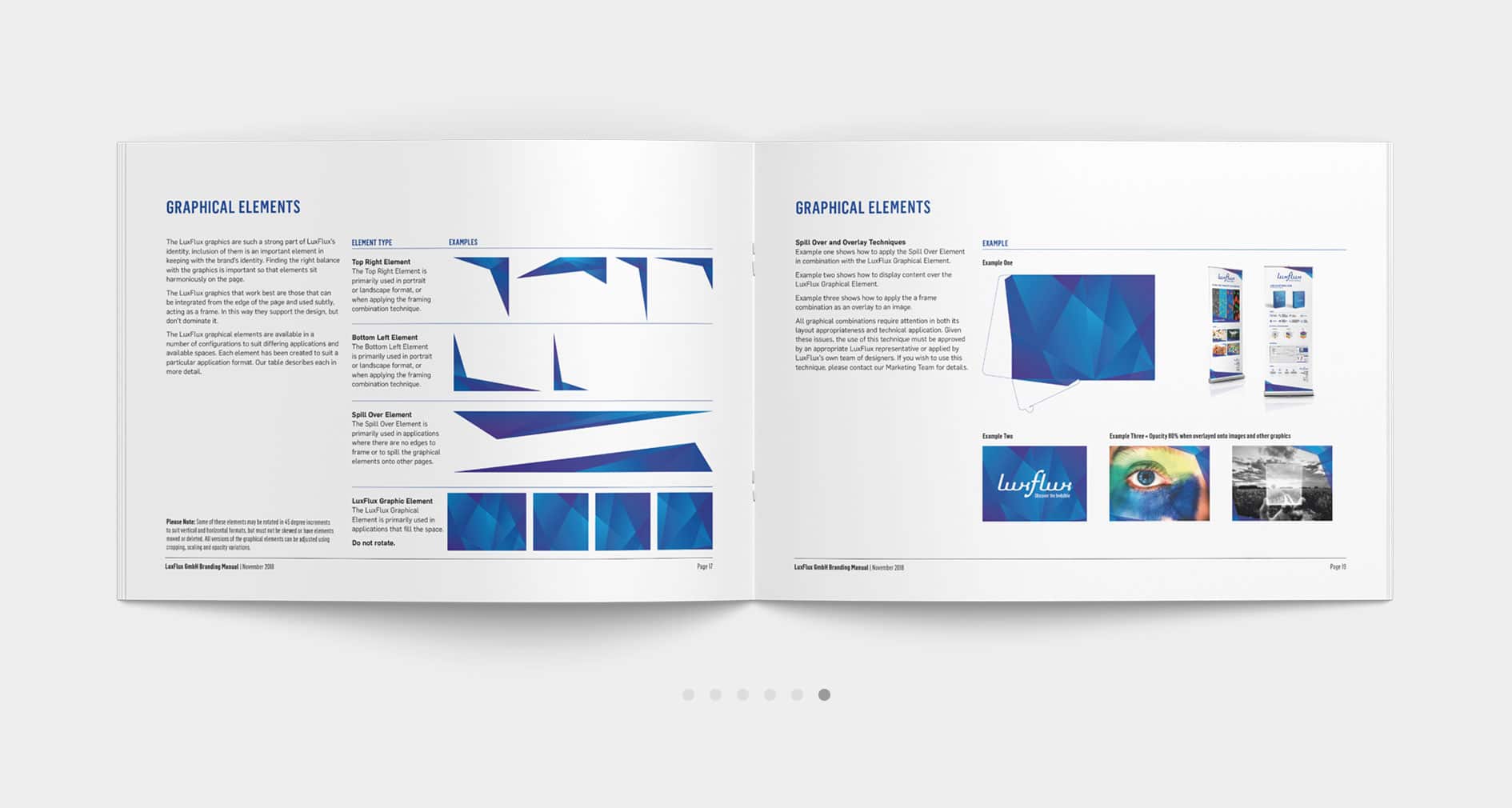
I was brought on to lead this transformation and deliver a complete brand refresh. Key components included a dynamic graphical system adaptable across print, digital, and software interfaces; clear, digestible technical datasheets; and a custom iconography suite for LuxFlux’s software platform.
Working closely with the founder, we anchored the brand strategy around a new core message: Discover the Invisible. I developed a visual language inspired by the geometric properties of light, spectrum, and refraction forms that evolve across different applications to evoke the feeling of shifting light and hidden layers, echoing the nature of hyperspectral imaging itself.
The result is a brand identity that not only reflects LuxFlux’s innovative technology but also strengthens their market position making them more recognisable, credible, and aligned with their mission.


CLIENT FEEDBACK
Right from the start, we were very impressed by Chrissie’s ability to accurately read our minds and deliver a corporate identity that perfectly symbolises our vision with style.
We trusted Chrissie to deliver what we’d asked for and were confident in her professional ability to design exactly what we needed. Chrissie was easy to communicate with, well organised, efficient and seriously talented at what she does.
It was exciting to see how our business developed a creative look, personality and it’s own identity. We really think that our new corporate identity and graphical elements truly represent who we are and what we do.
