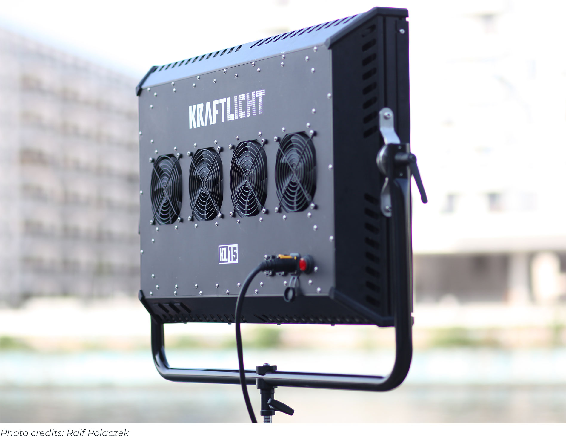
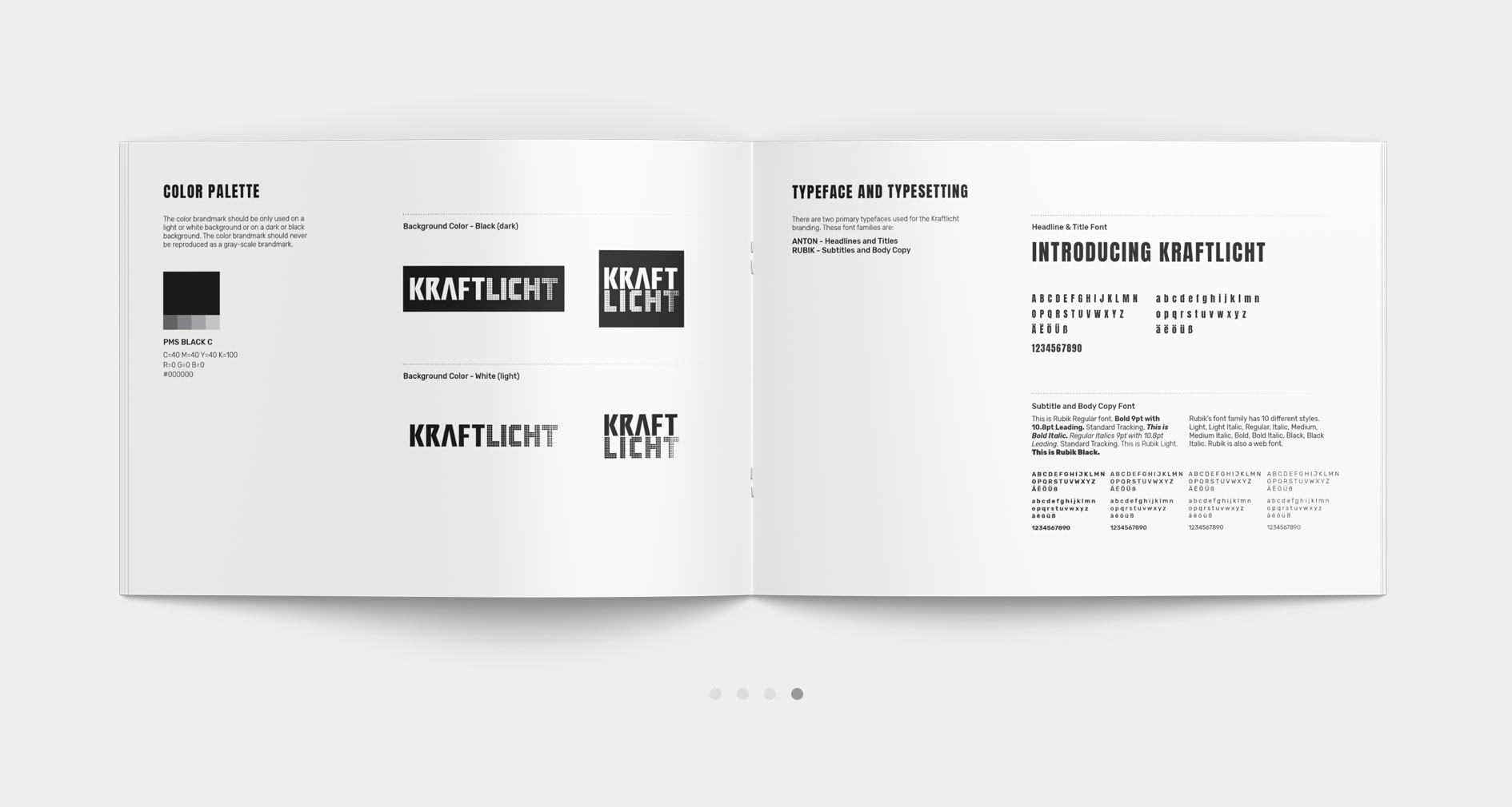
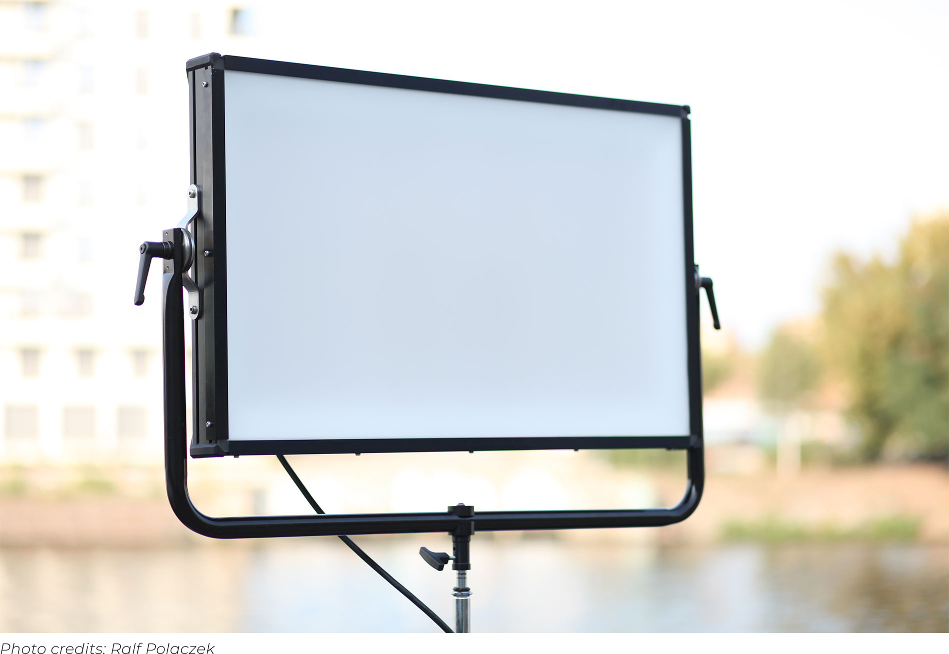
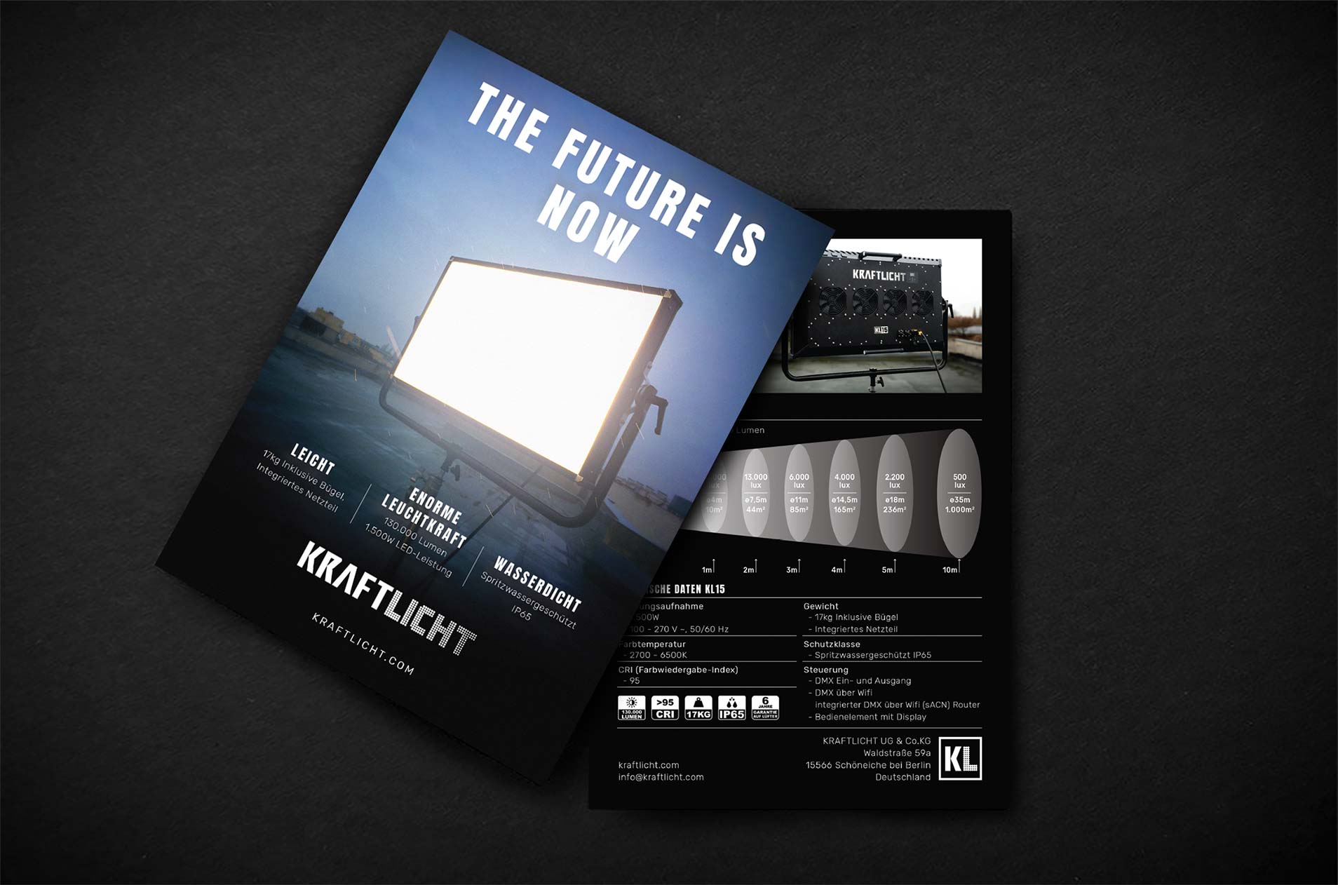
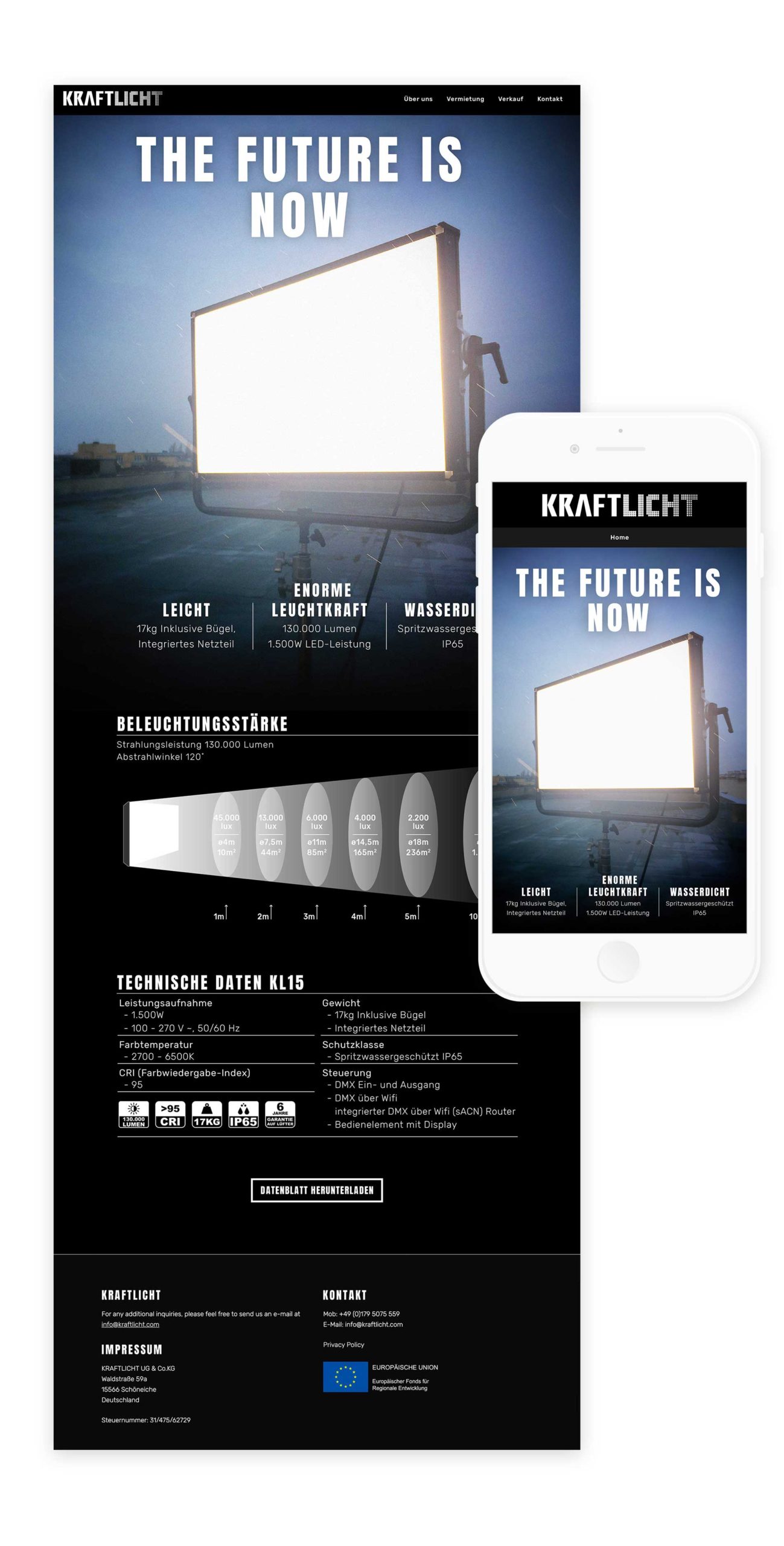
KRAFTLICHT is one of the most innovative lighting manufacturers in Berlin, Germany. They produce beautifully crafted LED lighting systems with superior output and colour quality. Their lights are designed to increase productivity and efficiency on any set, stage or studio.
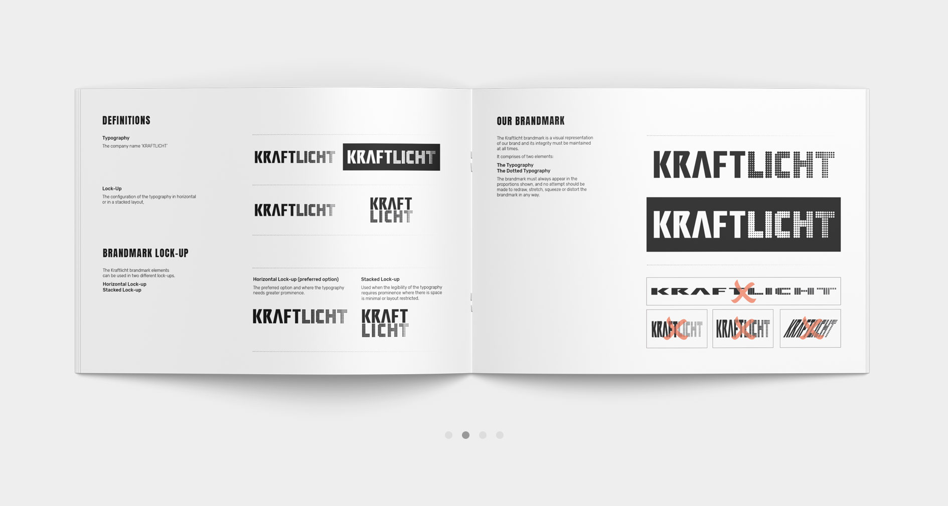
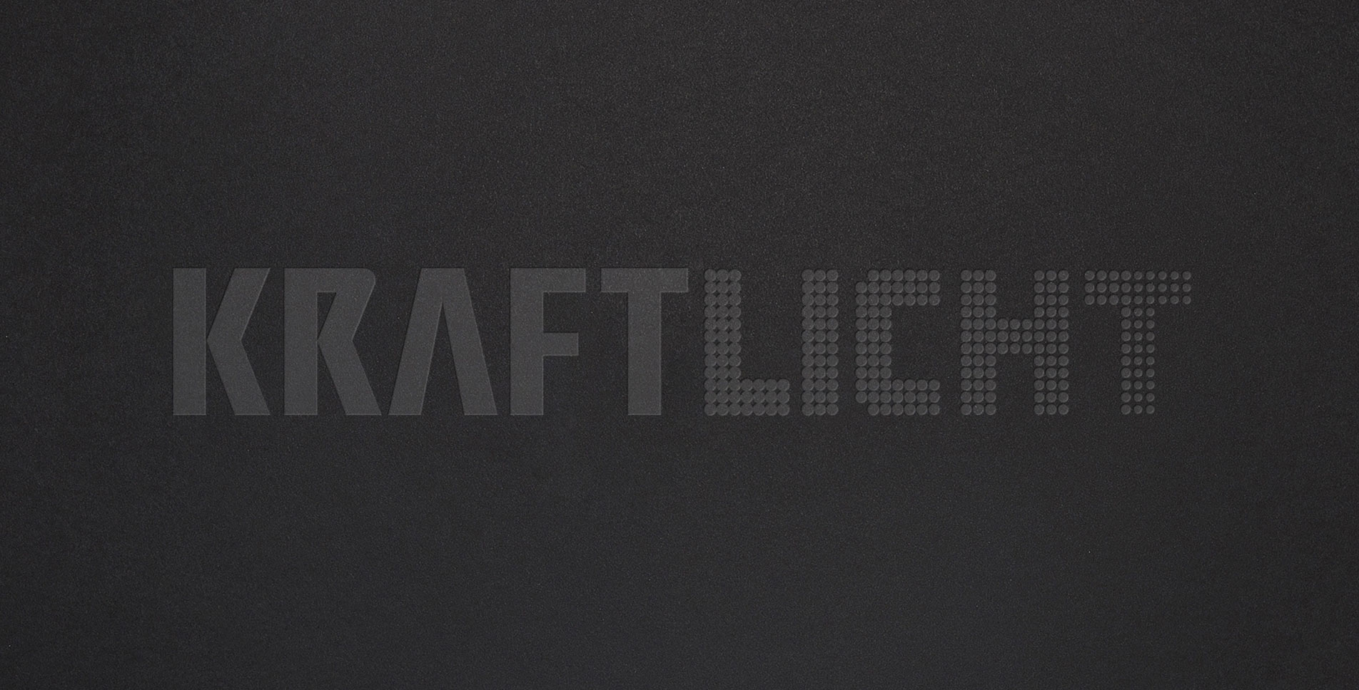
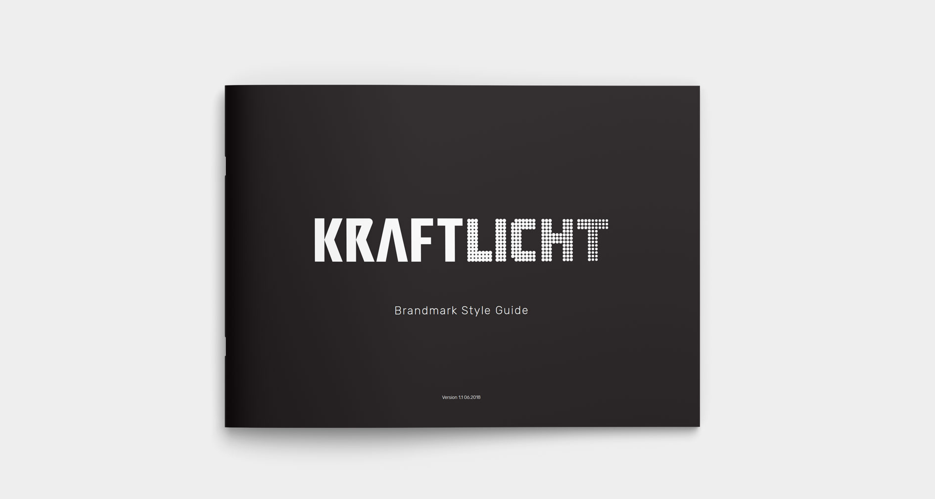
Not all brands need a symbol alongside their wordmark. On occasion, the wordmark on its own is robust enough, especially when a distinctive name like KRAFTLICHT is adopted.
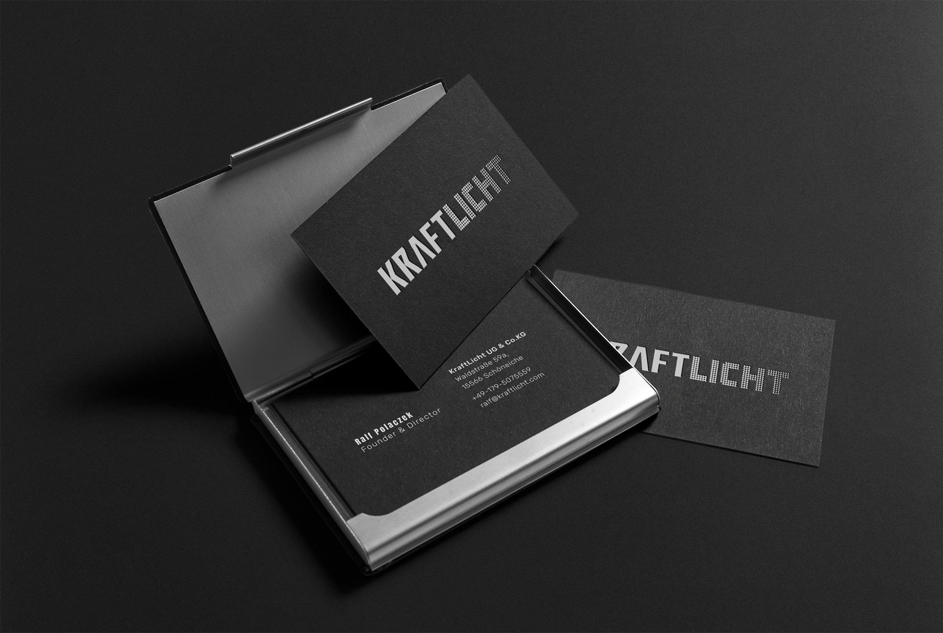
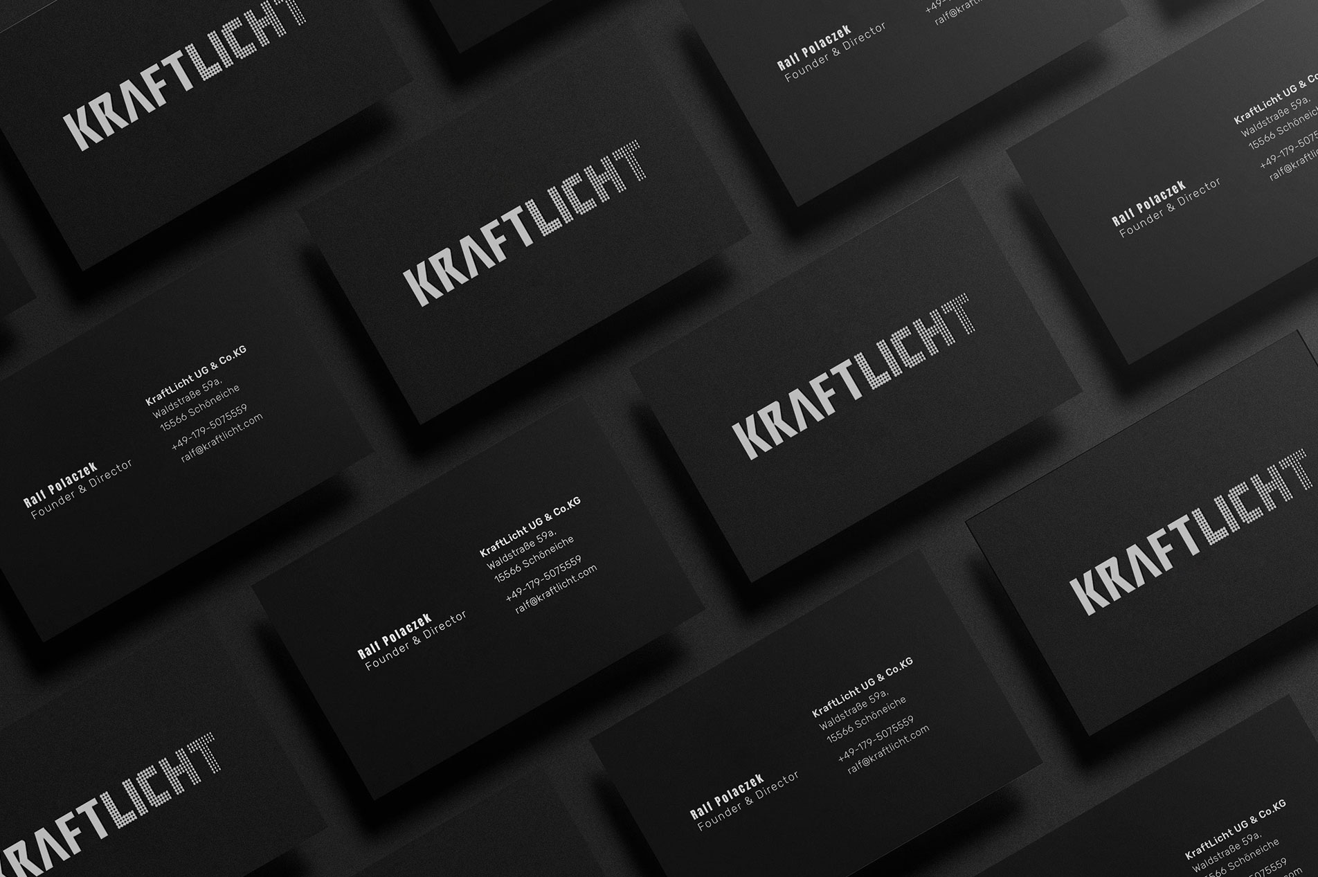
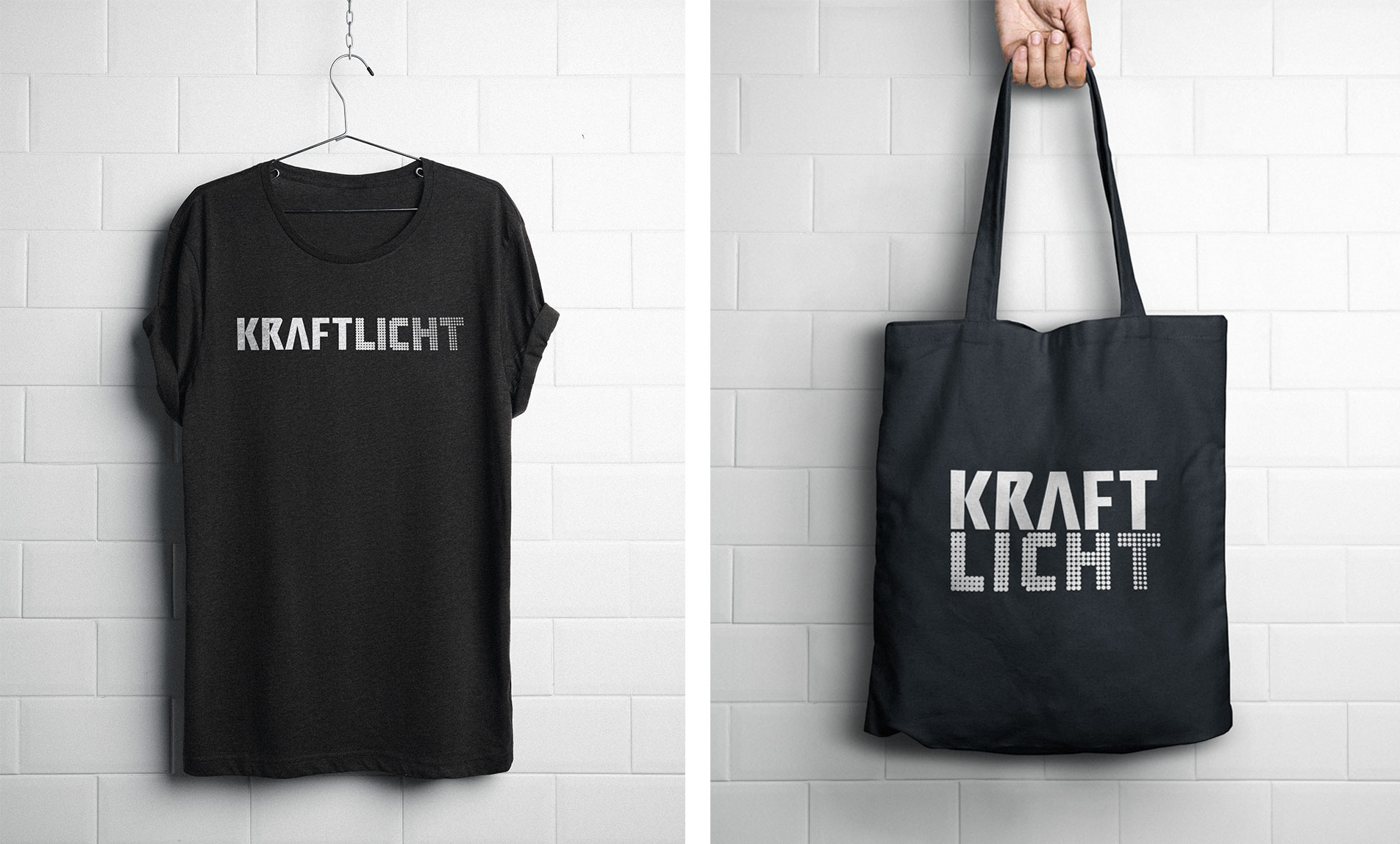
The bespoke typeface I created gave KRAFTLICHT a bright and cohesive appearance. The subtle black and white palette was a requirement for ensuring cost-effective mass production and retaining the brands’ equity for future product additions.




CLIENT FEEDBACK
We love our custom ‘dotted’ logo and typeface and are very excited about our brands’ direction. Our new logo truly represents what KRAFTLICHT’s about. We’ve always enjoyed working with Chrissie!
