LuxFlux is a Stuttgart-based, software company that specialises in analysing hyperspectral data. They take Hyperspectral Imaging technology from the lab and transform it into an industrial and embedded application for real-time environments.

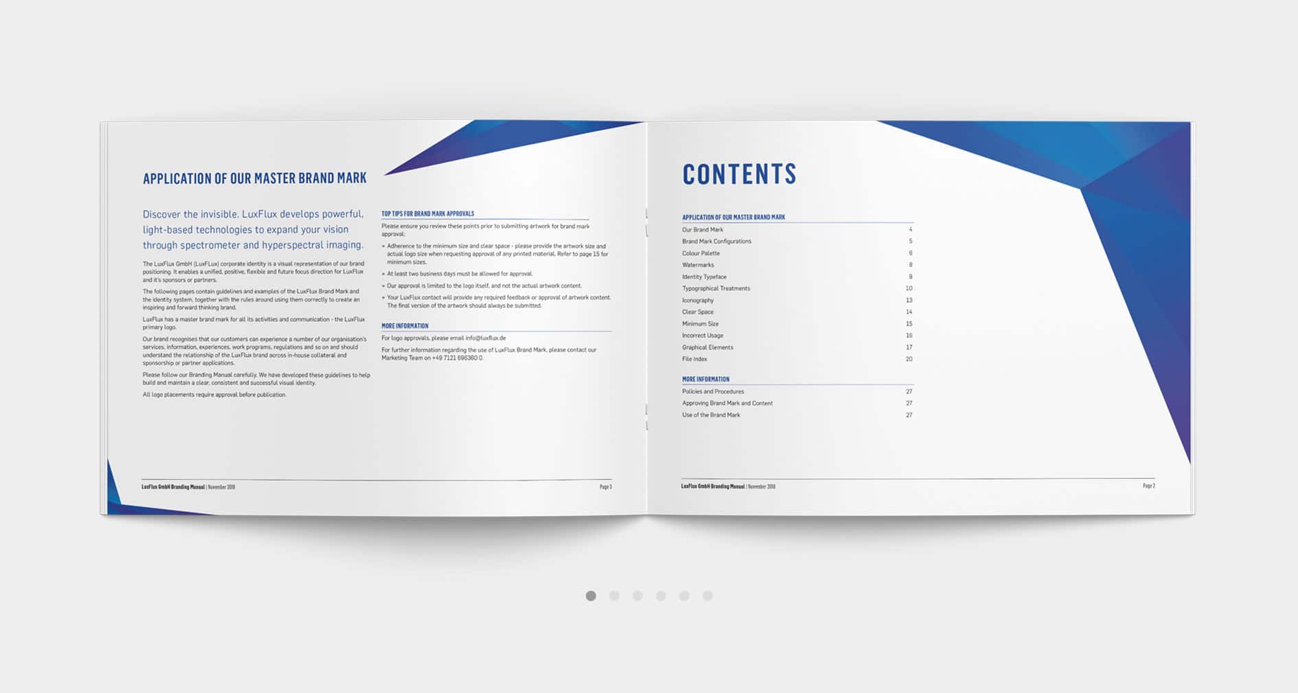
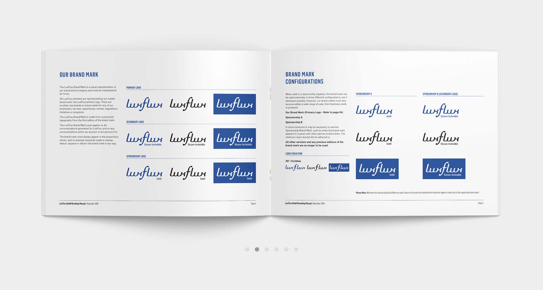
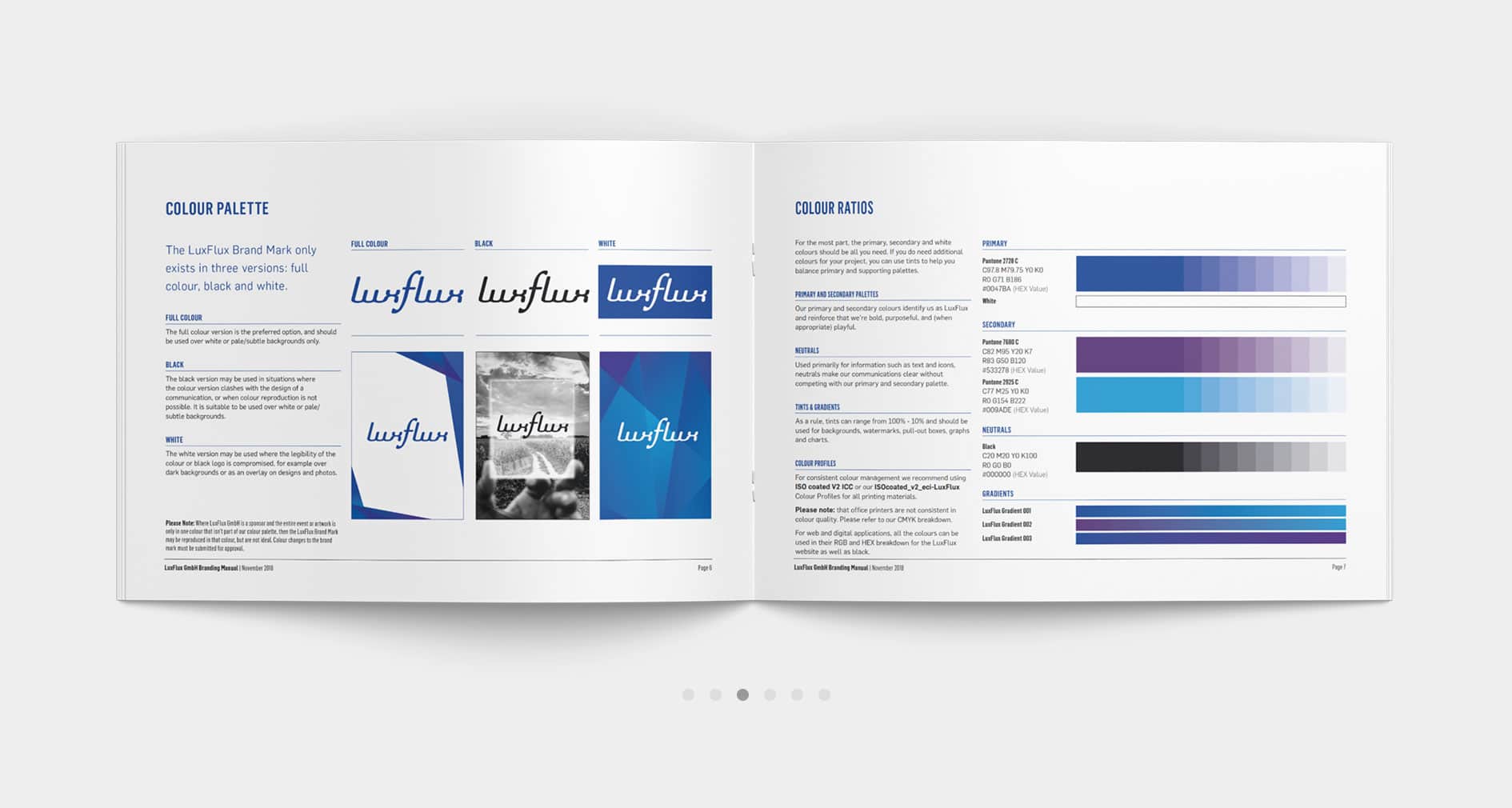
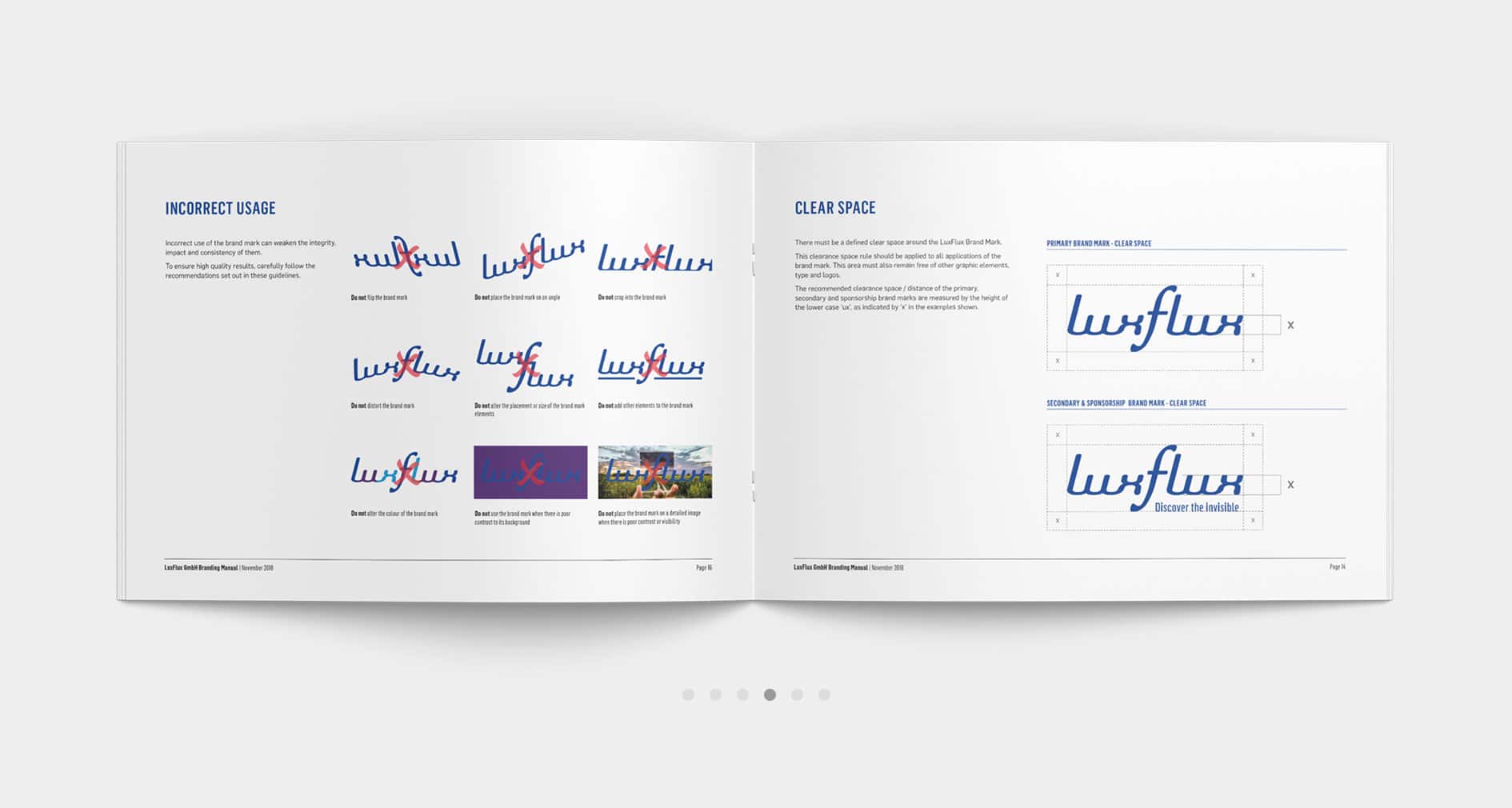
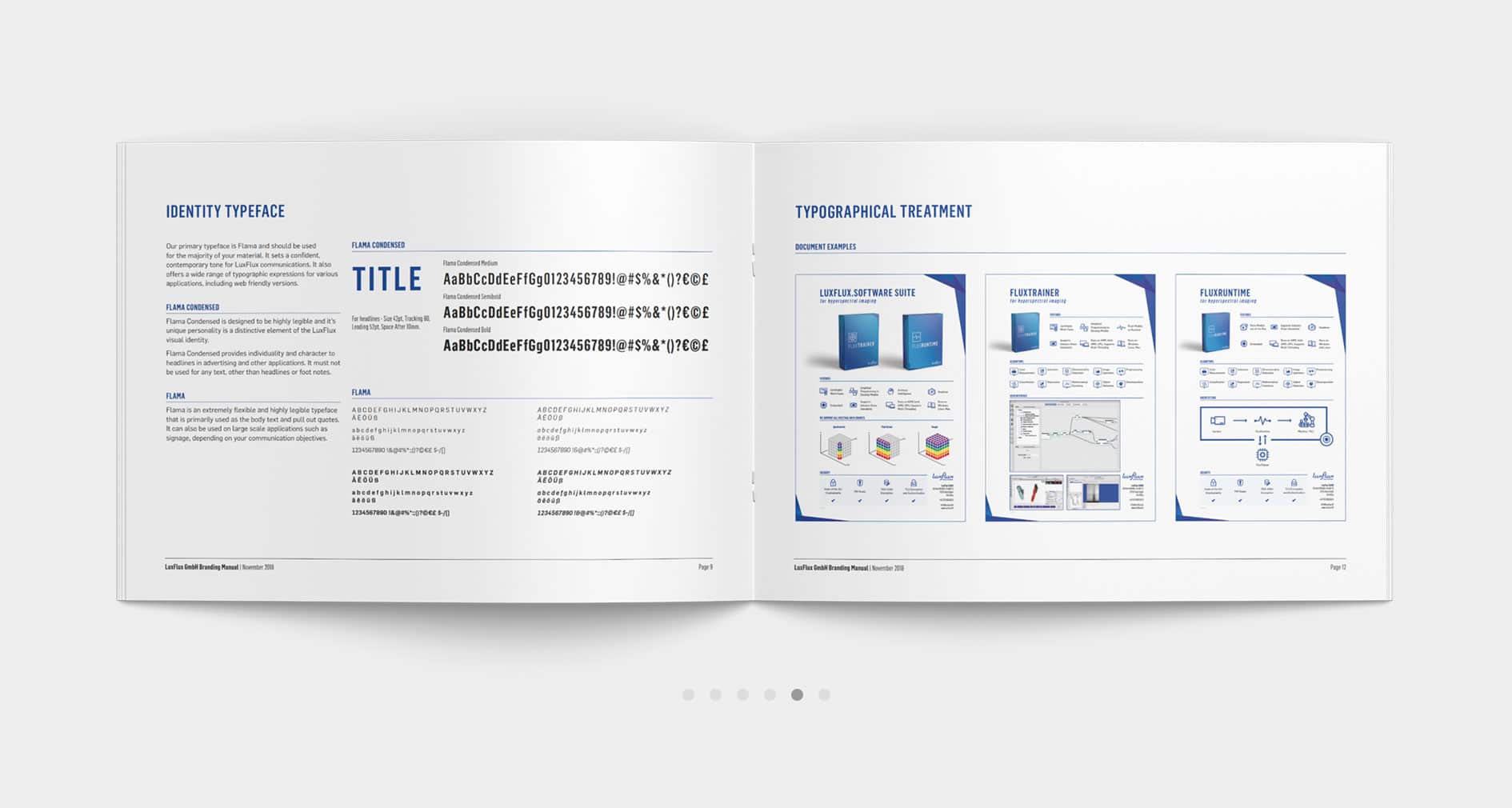
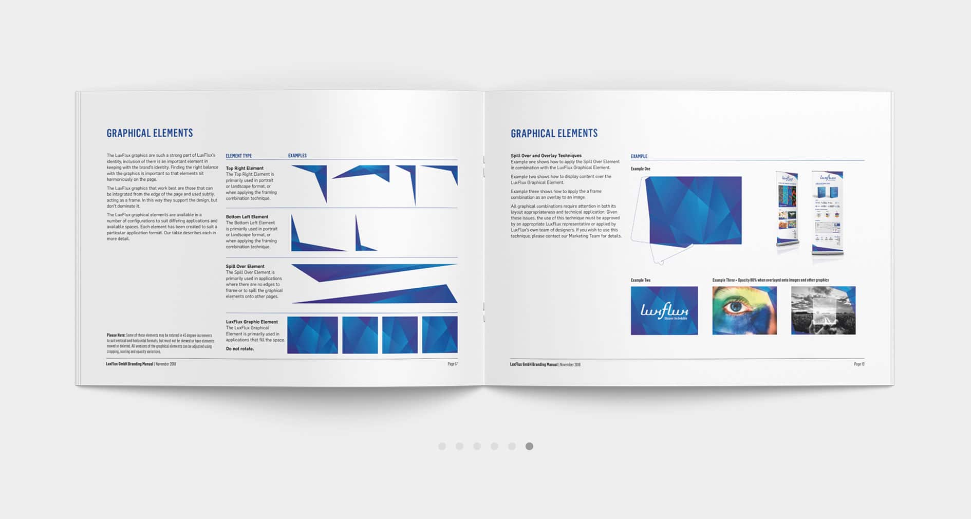
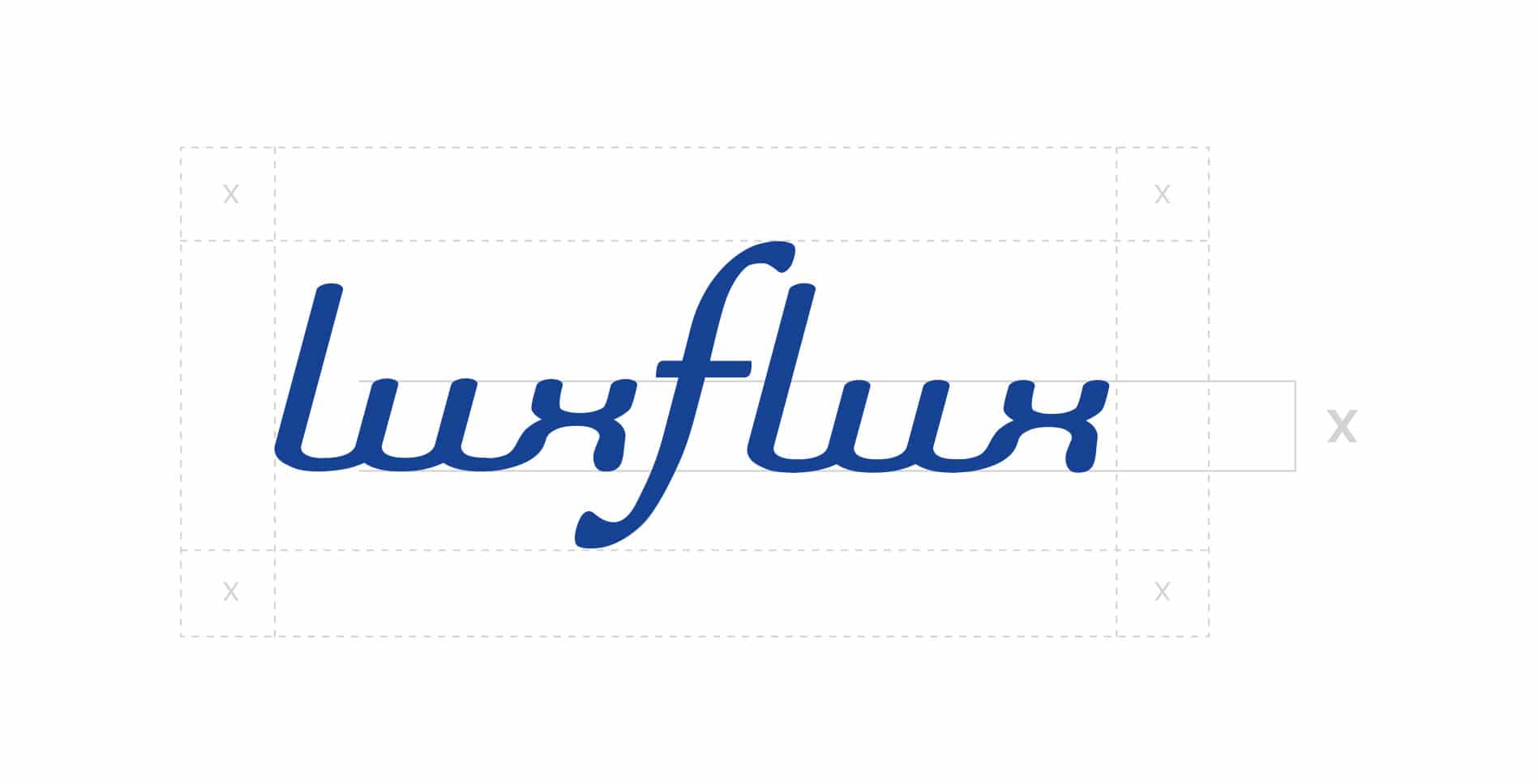
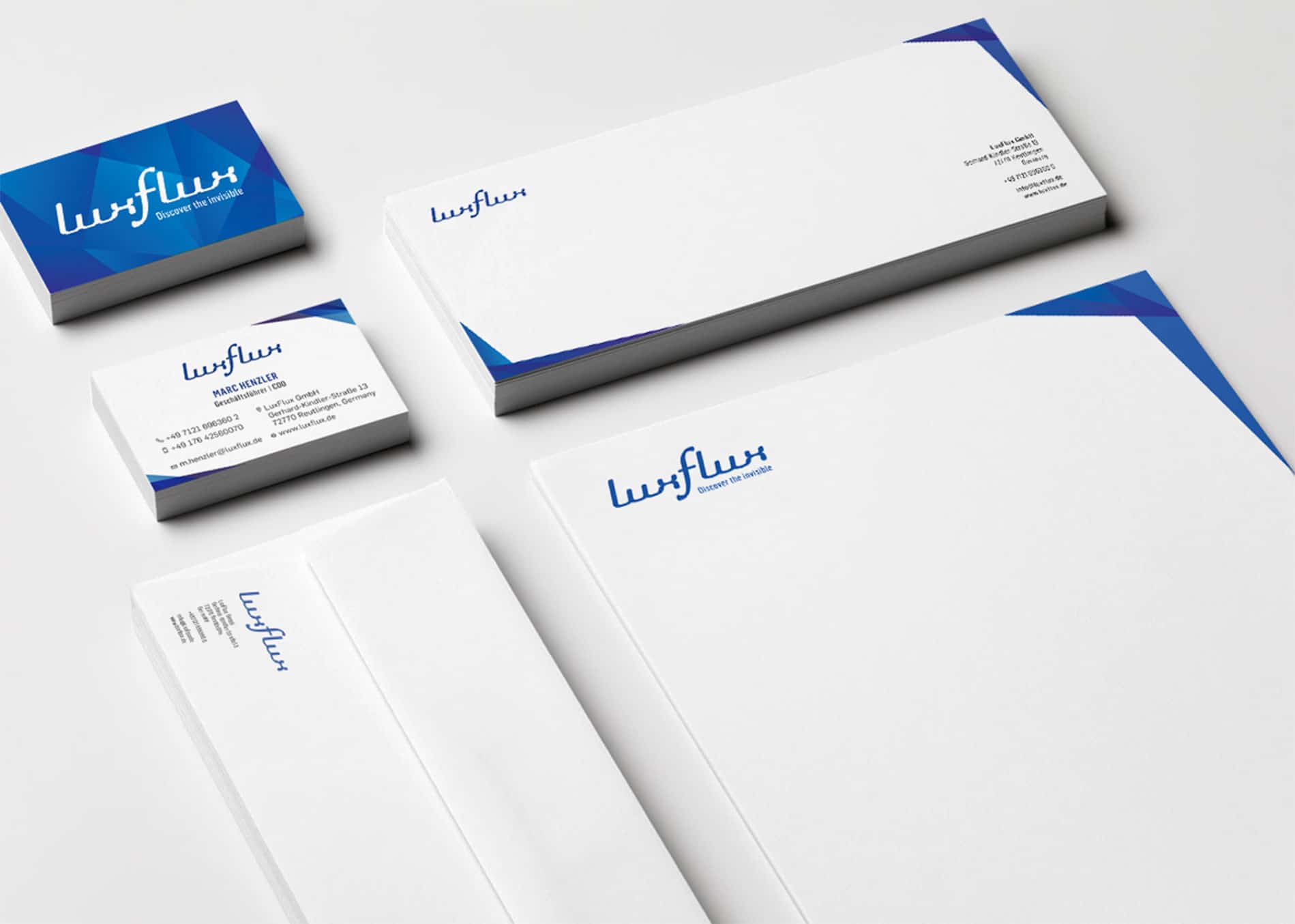
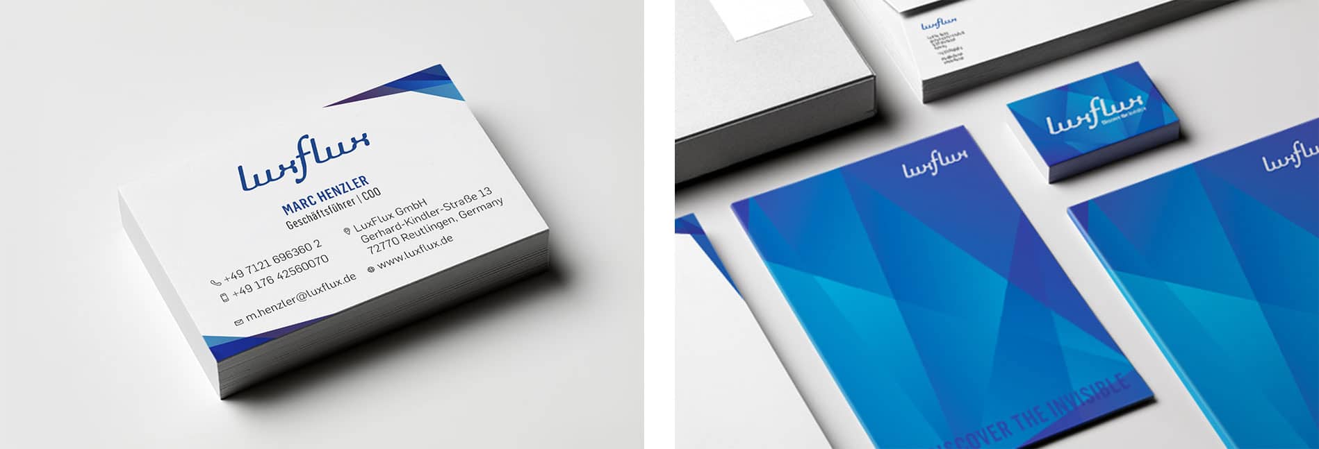
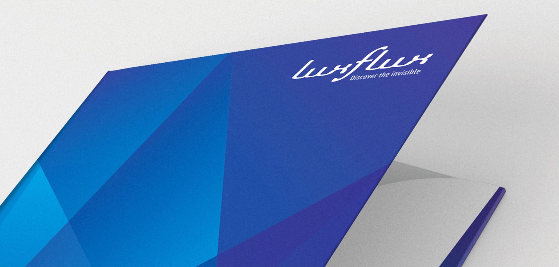
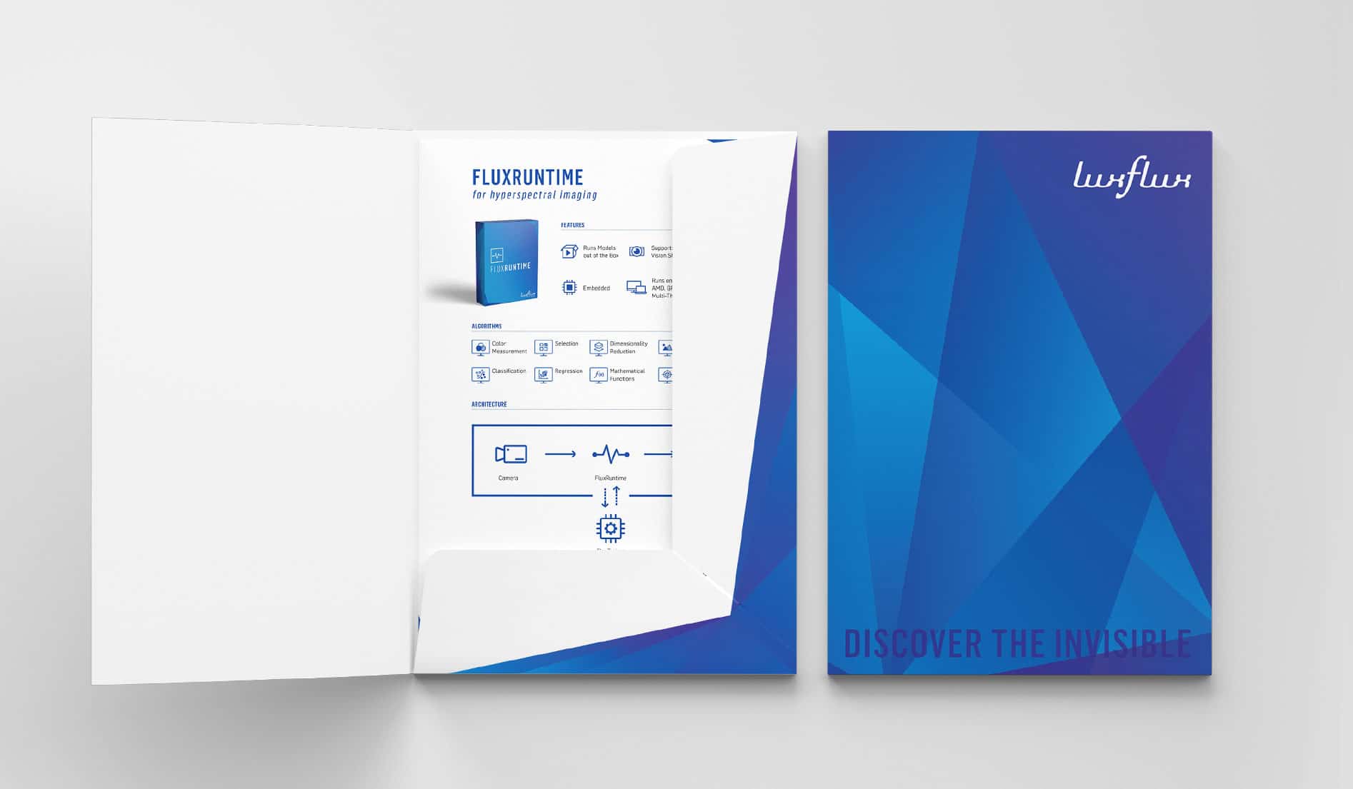
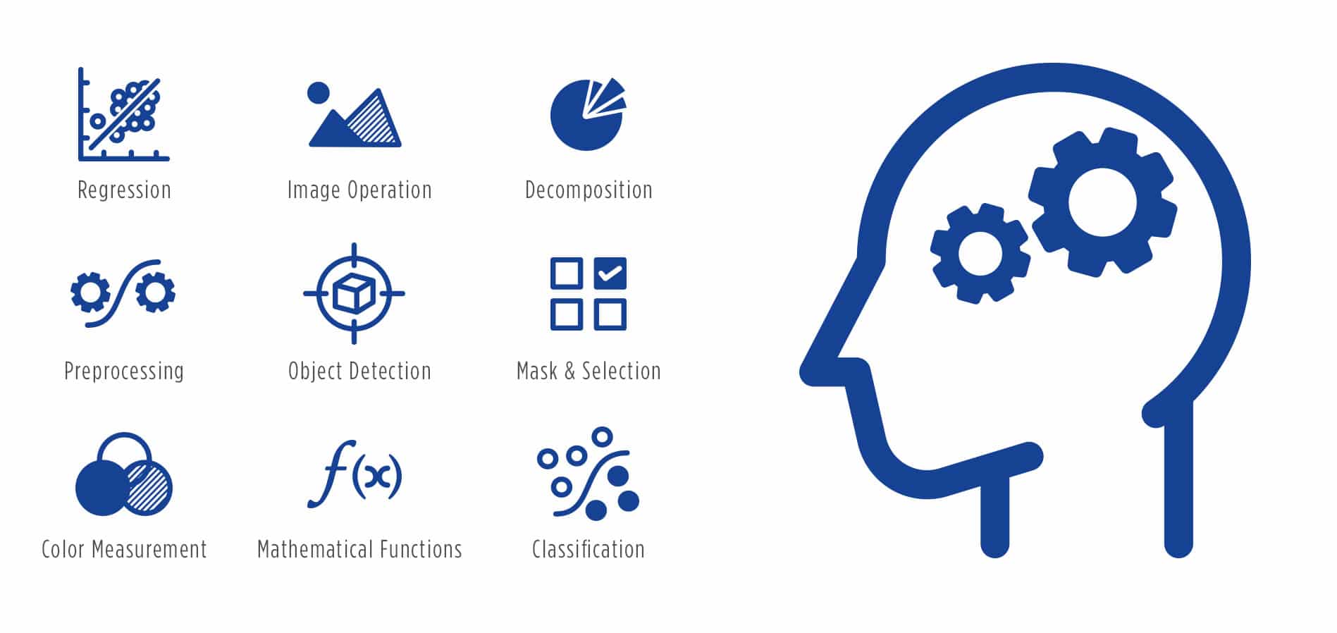
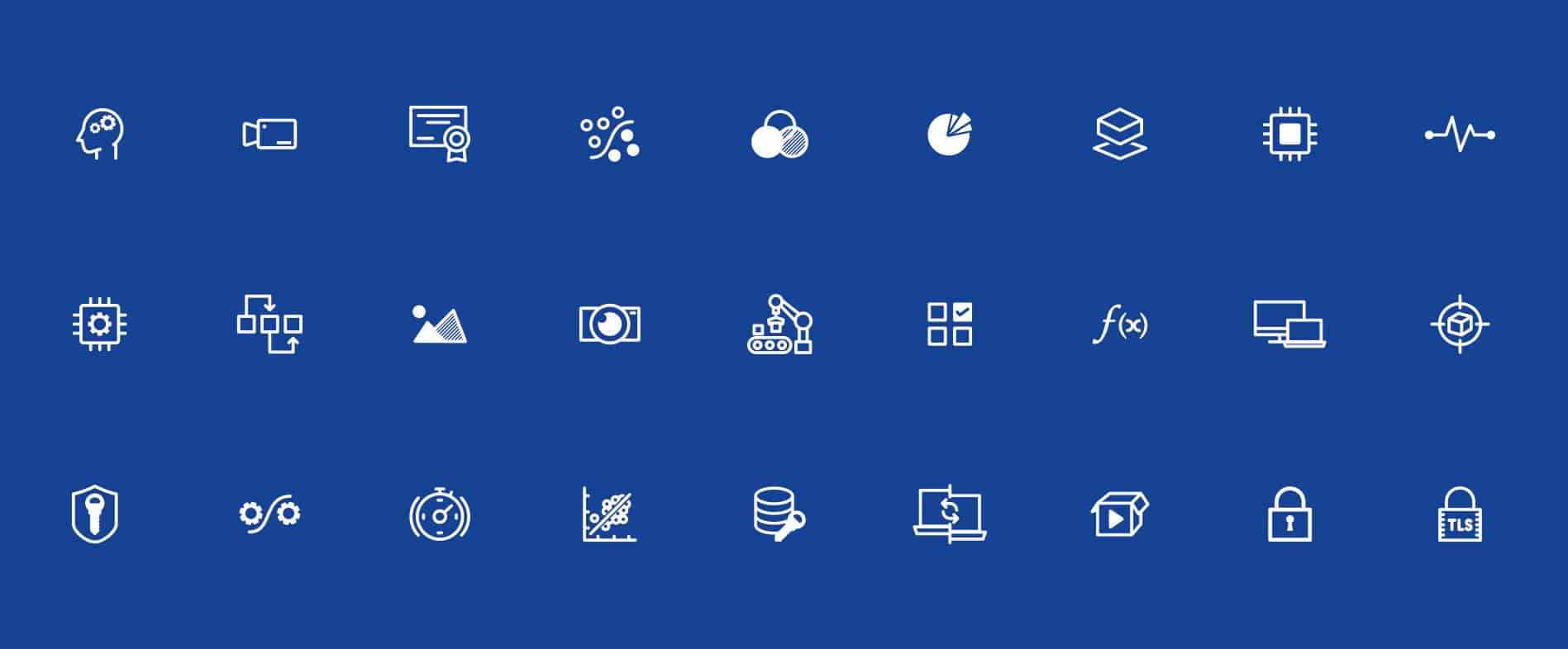
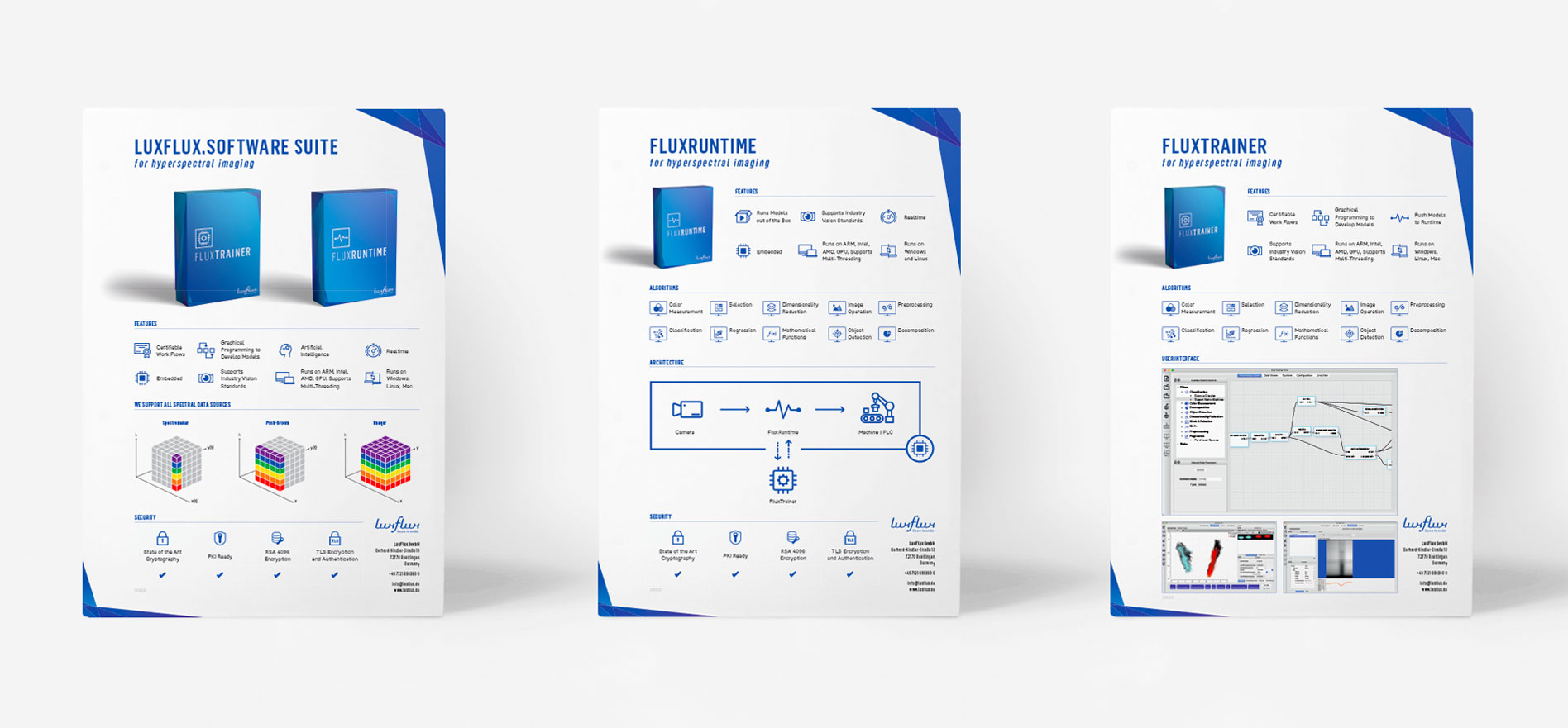
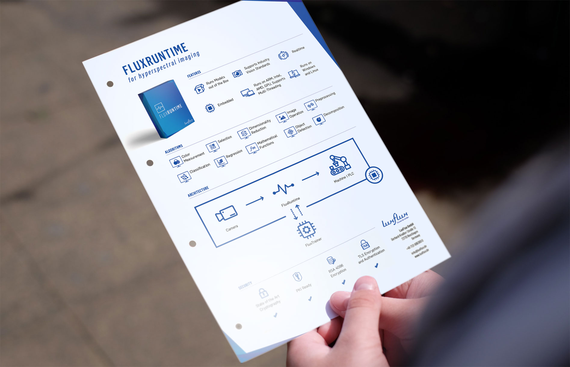
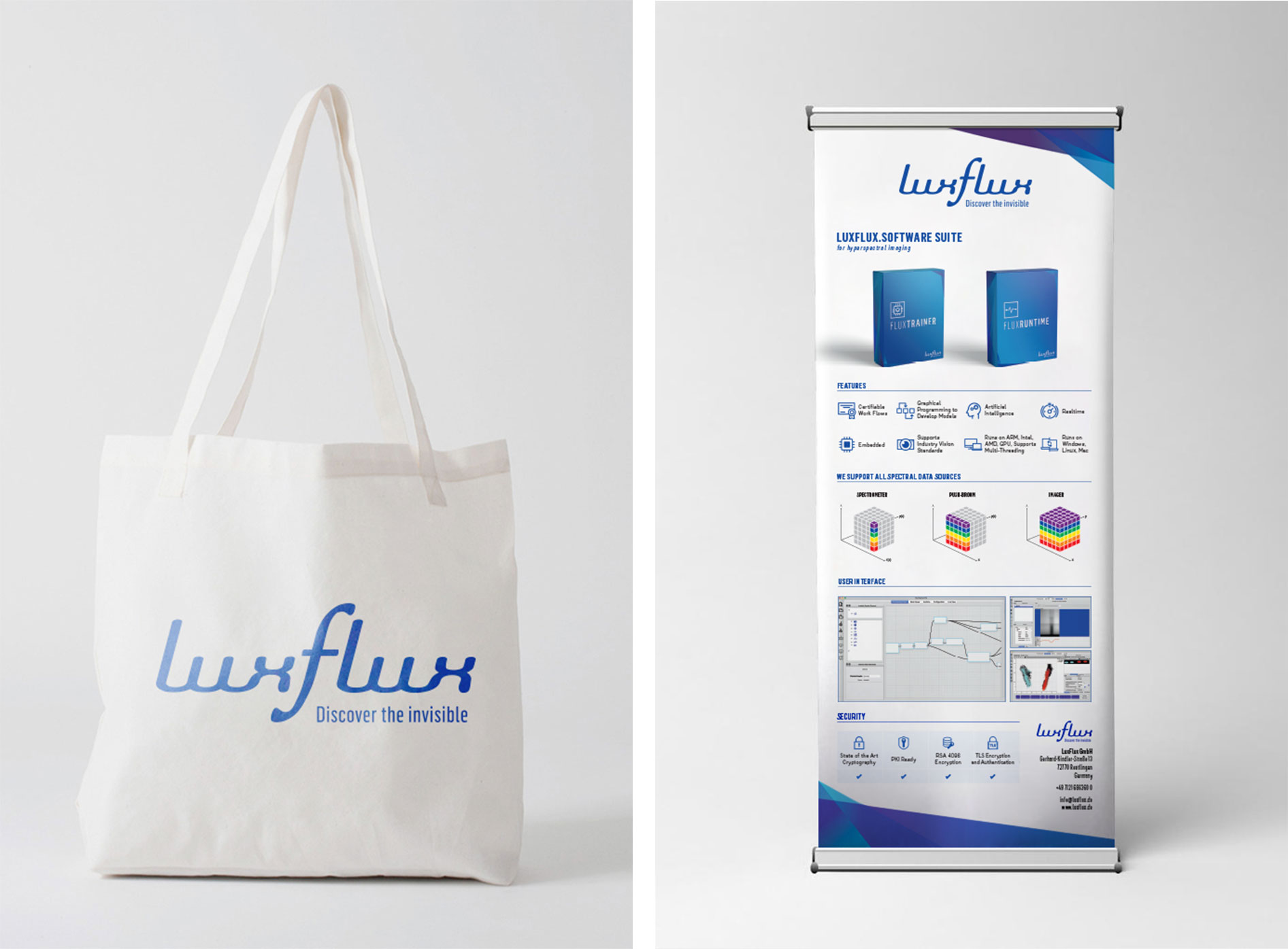
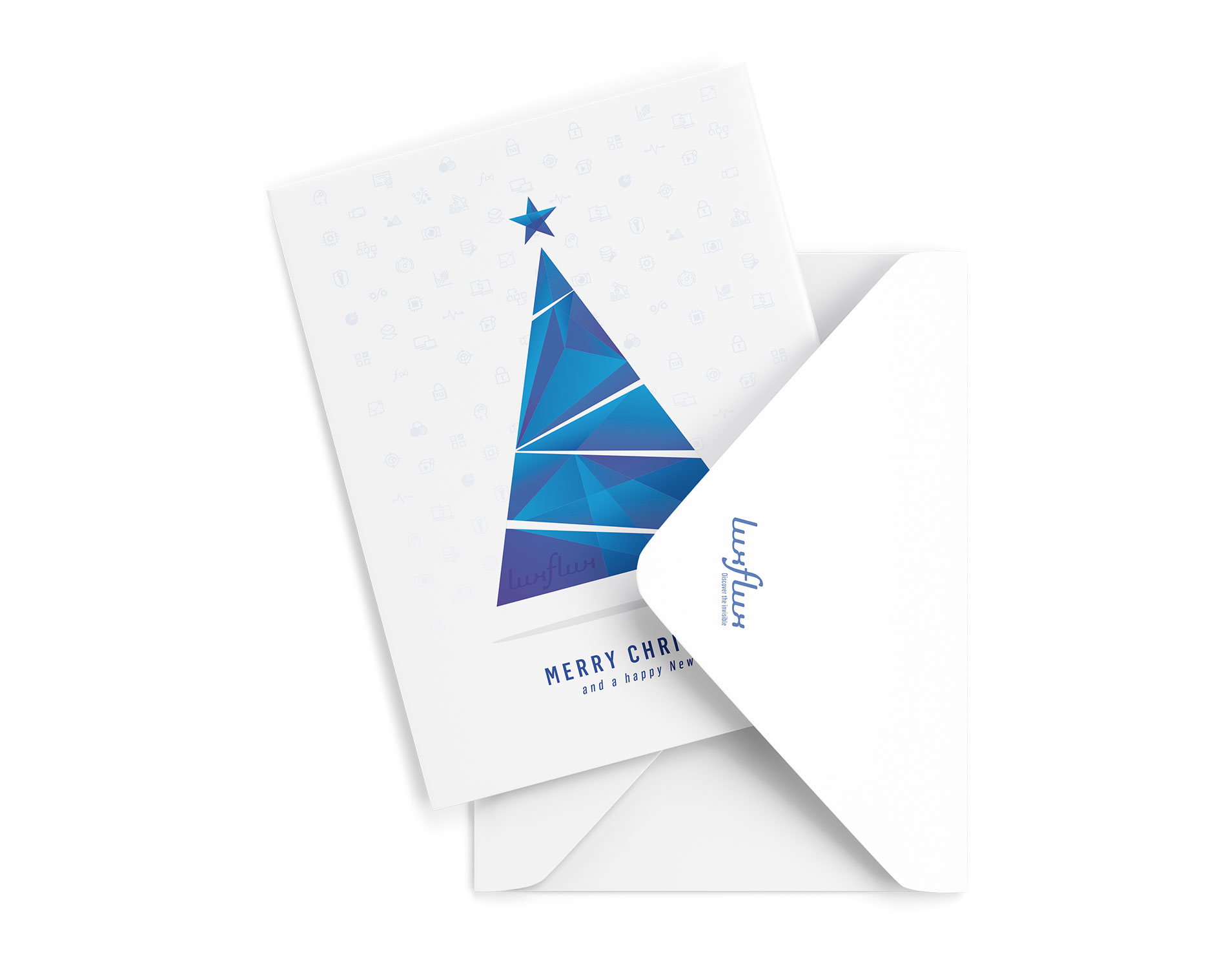
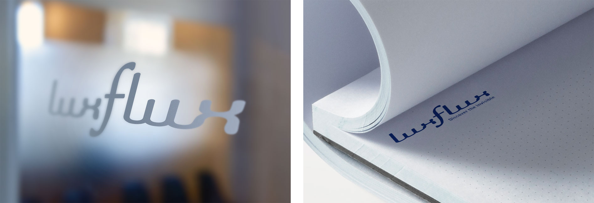
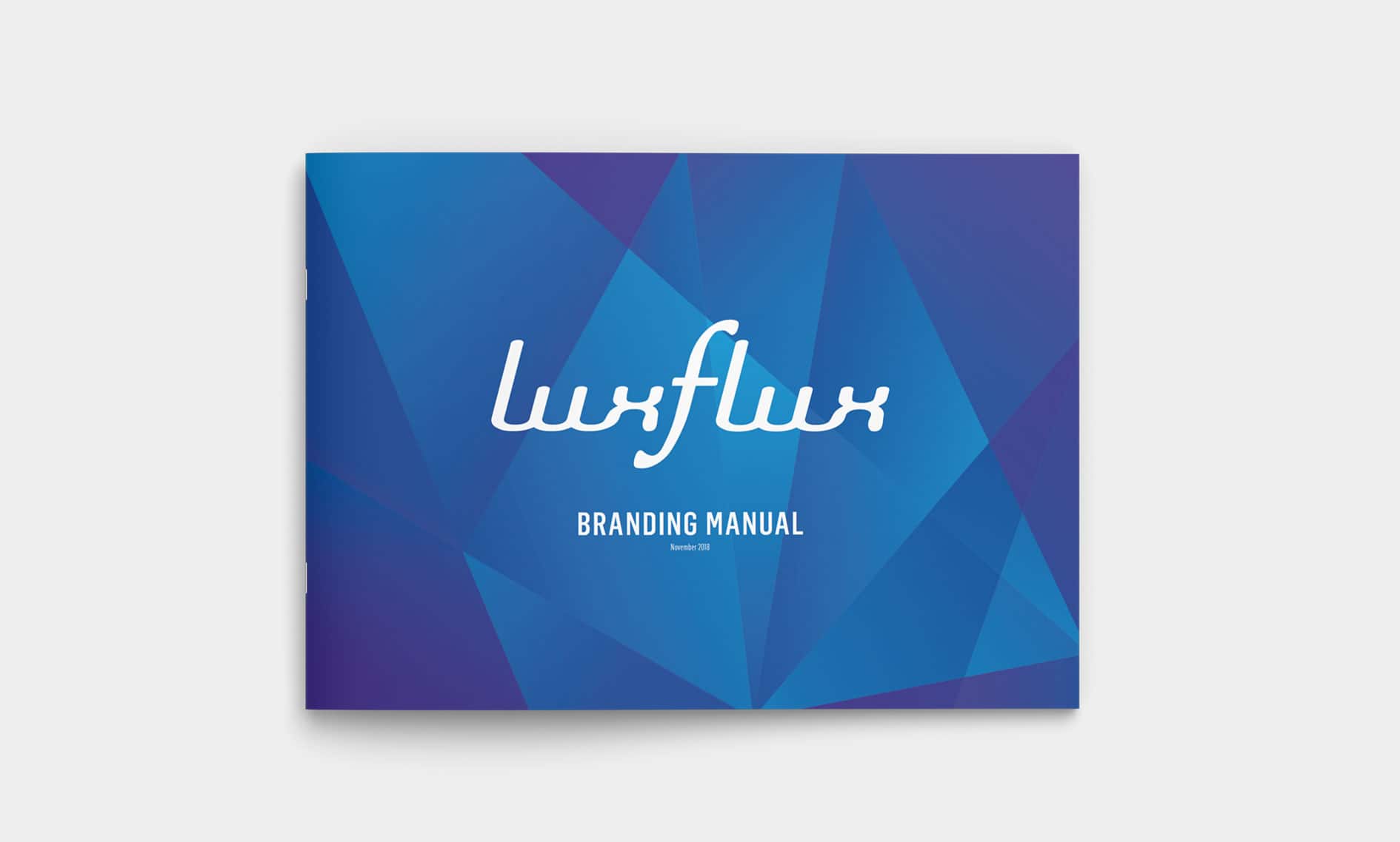
The underlying premise was to keep the current tone of LuxFlux in a fresh and modern redesign. I had the freedom to conceptualise a visual language across the brand to uniquely and functionally portray – Discover the invisible. Inspired by geometric forms, found in the light spectrum and refraction, helped to create an ever-evolving graphical system. These geometric forms appear differently in each application to give the feeling of ever-changing light. This new brand identity makes LuxFlux more accessible and useful to its users.
CLIENT FEEDBACK
Right from the start, we were very impressed by Chrissie’s ability to accurately read our minds and deliver a corporate identity that perfectly symbolises our vision with style.
We trusted Chrissie to deliver what we’d asked for and were confident in her professional ability to design exactly what we needed. Chrissie was easy to communicate with, well organised, efficient and seriously talented at what she does.
It was exciting to see how our business developed a creative look, personality and it’s own identity. We really think that our new corporate identity and graphical elements truly represent who we are and what we do.
